Sales Dashboards That Turn Pipeline Data Into Action
A practical look at how I designed a suite of sales dashboards in Salesforce CRM Analytics to improve pipeline visibility, forecasting and deal-level action.
By Jon Miller | LeaveToUs
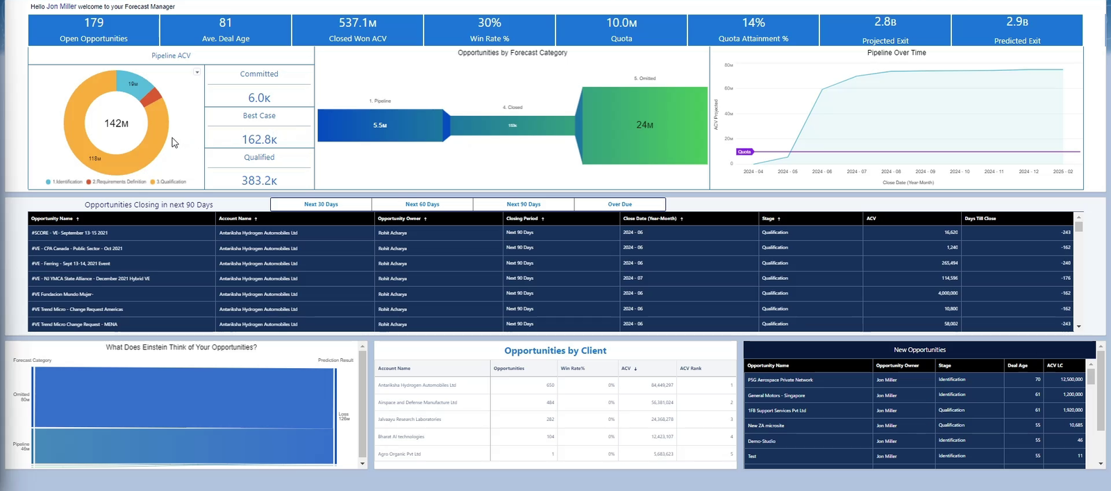
The home view combines executive KPIs with the opportunities that need attention now.
Most sales dashboards answer the easiest question: what is in the CRM? A useful sales dashboard has to go further. It should show whether the number is credible, what has changed, where risk is building and which action will improve the outcome.
That principle shaped the pipeline and forecasting solution shown here. I built the suite in Salesforce CRM Analytics, Salesforce’s native analytics platform, so that sales leaders and opportunity owners could work from the same CRM data without leaving their normal workflow. The result was not a single report. It was a connected set of interactive sales dashboards designed around the different decisions made during a forecast cycle.
One connected pipeline and forecast management app
The model brings forecasting, pipeline inspection, performance analysis and sales leadership reporting together in one CRM application. Each area has its own summary and detailed views, but all of them use the same underlying opportunity, account and activity data. This structure gives leaders a clear route from the forecast headline to the individual deals and behaviours driving it.
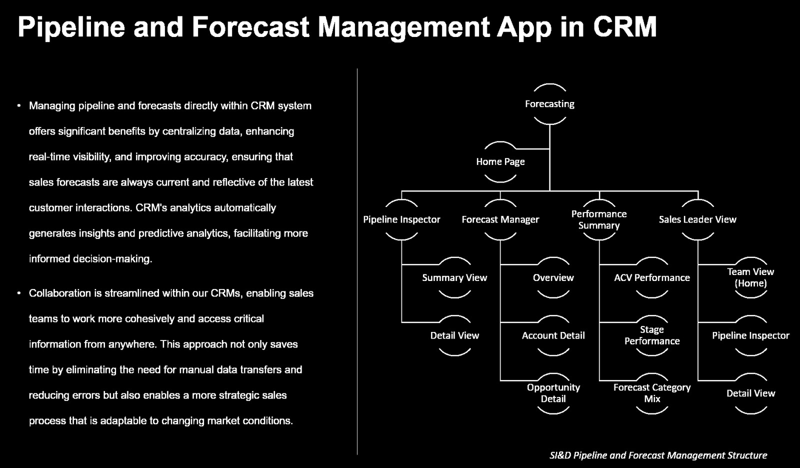
The Salesforce CRM Analytics app structure connects forecasting, pipeline inspection, performance reporting and sales leadership views.
Start with the decision, not the chart
Dashboard projects often begin with a list of metrics and visual types. That tends to produce crowded pages with plenty of information but little direction. I began instead with the decisions each user needed to make.
| User | Decision supported |
| Sales leader | Can we trust the forecast and where does intervention matter most? |
| Sales manager | Which deals need challenge, coaching or an immediate next step? |
| Opportunity owner | What must move, by when and what is blocking progress? |
| Revenue operations | Where are data quality, process or pipeline coverage issues developing? |
A clear executive view of the number
The landing page gives an immediate view of open opportunities, average deal age, closed won value, win rate, quota attainment and the projected exit position. Those measures provide context, but context alone does not drive action. The same page therefore surfaces upcoming and overdue opportunities, pipeline by forecast category, client concentration and newly created deals.
This combination matters. A headline forecast can look healthy while being supported by ageing opportunities, a small number of accounts or deals with weak close discipline. Putting the summary and its underlying drivers together makes it much easier to challenge the number in the room.
Inspect pipeline quality, not only pipeline value
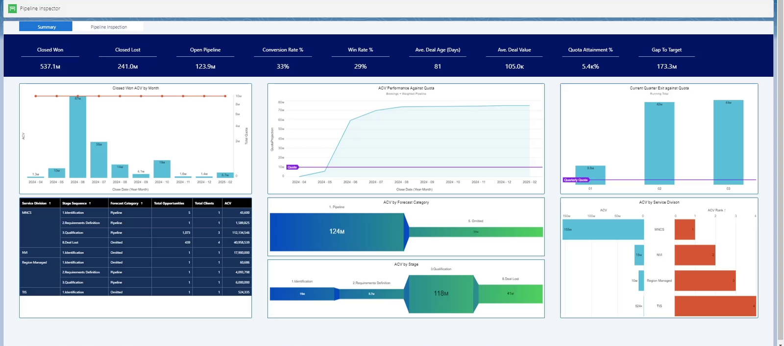
The Pipeline Inspector connects summary measures to the stage and forecast composition beneath them.
Pipeline value is one of the most misleading numbers in sales when it is viewed in isolation. The Pipeline Inspector adds the measures required to judge quality: closed won and closed lost value, conversion, win rate, average deal age, average deal value, quota attainment and the gap to target.
Users can then move from the summary into detailed inspection by stage, forecast category, service line, account, opportunity and owner. This makes the dashboard useful in both a leadership review and a one to one. The same metric can be challenged at organisational, team or individual deal level without maintaining separate versions of the truth.
Make forecast risk visible early
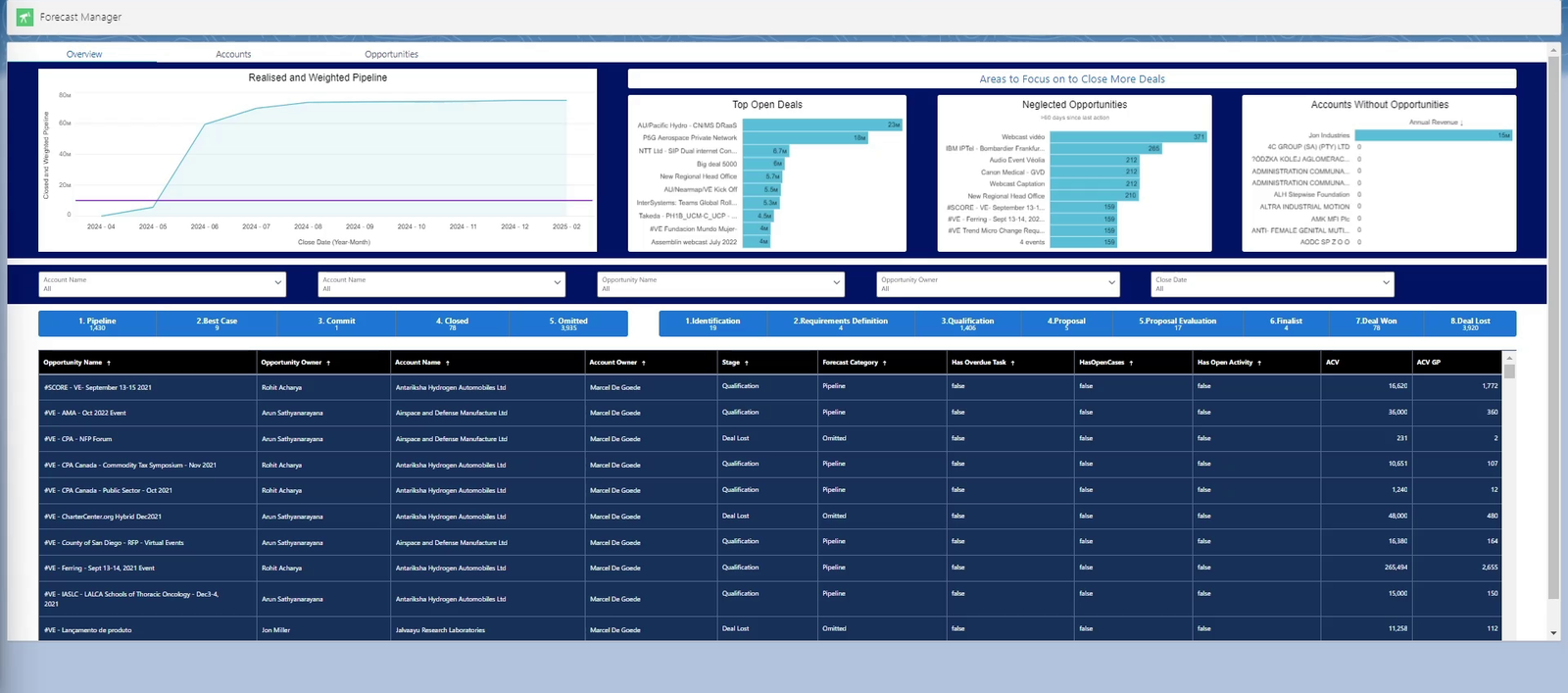
The Forecast Manager highlights top open deals, neglected opportunities and accounts with no active pipeline.
The Forecast Manager was designed around intervention. It shows the realised and weighted pipeline alongside the largest open deals, neglected opportunities and accounts without opportunities. It also exposes basic execution signals such as overdue tasks, open cases and open activity.
That shifts the conversation from “What number are you calling?” to “What evidence supports the call?” A commit deal with no recent activity or an overdue next step should not carry the same confidence as an actively managed opportunity. By placing those signals next to the forecast, risk becomes visible before the end of the period rather than after a miss.
Track movement through the forecast cycle
A forecast is a moving position, not a static total. The solution distinguishes pipeline, best case, commit, closed and omitted categories and allows the underlying opportunity list to be inspected at each point. It also shows deals moving into and out of scope.
This is important because a stable total can hide substantial volatility. New deals may be compensating for slippage. Commit may be growing because categories are being changed rather than because buyer progress has improved. Movement analysis reveals that behaviour and gives revenue operations a much stronger basis for forecast governance.
Give leaders a performance view with context
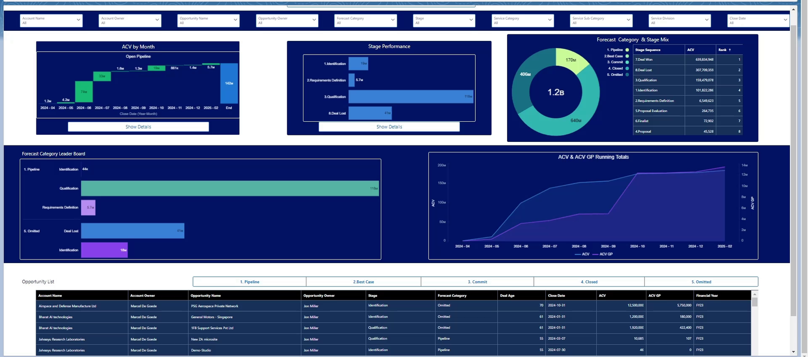
Performance reporting links monthly movement, stage mix and forecast categories to the opportunity detail.
The performance view brings together pipeline creation by month, stage performance, forecast category mix and cumulative value. The aim is not to create a league table for its own sake. It is to show how the result was produced and whether it is repeatable.
A sales leader can see whether performance depends on one period, one stage or one unusually large opportunity. They can also compare weighted and unweighted positions and drill into the deals creating the gap. That makes the dashboard a coaching tool as well as a reporting tool.
Build the sales dashboards in Salesforce CRM Analytics
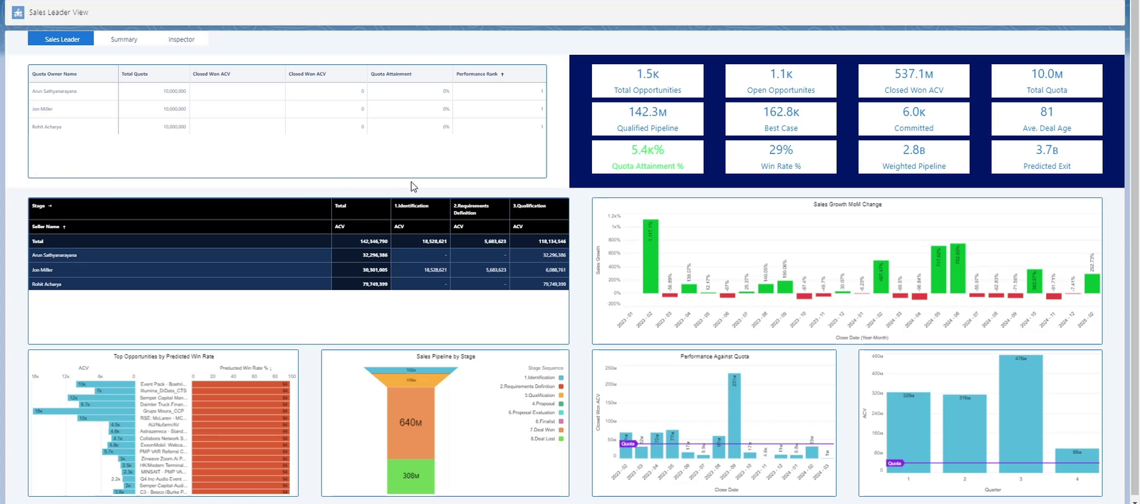
The sales leader view combines quota, attainment, stage distribution and month on month change.
Building the suite in Salesforce CRM Analytics was a deliberate adoption decision. CRM Analytics is the current Salesforce name for the cloud-based platform previously known as Tableau CRM and Einstein Analytics. Users did not need to switch to a separate analytics environment or wait for a manually prepared pack. Filters, opportunity records and supporting activity remained connected to the workflow where the team already managed the pipeline.
The dashboard is most valuable when it becomes part of a consistent cadence. The executive overview supports the weekly forecast call. Pipeline inspection supports manager challenge and deal reviews. Performance views support monthly analysis and coaching. Revenue operations can use the same suite to identify stale data, missing activity and process exceptions.
What makes a sales dashboard genuinely useful
One version of the truth. Headline measures and opportunity detail must reconcile and use the same definitions.
A route from insight to action. Every summary should lead naturally to the deal, owner or account requiring attention.
Visible forecast logic. Users should be able to understand how stage, category, probability and timing shape the number.
Different views for different decisions. Executives, managers and sellers need consistent data but not identical pages.
Integration with the sales process. The dashboard should reinforce the operating cadence rather than sit beside it as a separate reporting exercise.
The real test is whether behaviour changes
A polished dashboard is not automatically a valuable one. The real test is whether managers challenge risk sooner, sellers maintain better opportunity data and leaders spend less time debating whose spreadsheet is correct.
That was the objective behind this design: turn CRM data into a practical management system for pipeline, forecasting and performance. When the dashboard connects the headline number to its underlying evidence, it does more than describe the sales organisation. It helps run it.